


The award-winning rebranding agency.
Data-driven branding, trusted by the top brands on the planet.
Trusted by


A note to Bozzuto from our founder, Joe Brottman.


Founder + Creative Director - Joe Brottman
Thanks for stopping by. I heard you’re looking to rebrand some properties fast. We’re all about building relationships, so we’d be happy to help you hit those deadlines together and deliver a stunning rebrand.
We’ve built our reputation in the consumer and B2B markets, and are now bringing our expertise into real estate. We’ve curated a collection of spec work below, showcasing our approach to property branding that I think you’ll love.
If you like what you see, book a call with me and let’s chat.
Joe Brottman

-
![]()
“Built a brand experience that is a true sense of wonderment and discovery.”
LA Times
-
![]()
“The most talented creative, branding, and design minds in this space.”
Ilnuma Consulting Partners
-
![]()
“Not only a highly skilled design firm, but a true creative thought partner.”
Tapingo
-
![]()
“The only firm I trust for branding. They changed the face of our company and helped bring in over $20M in funding.”
Rainmaker
-
![]()
“Brottman prescribed and implemented world class solutions that changed our brand forever.”
Iver Studios


We specialize in helping companies reposition and rebrand for growth.
Businesses change, get acquired, and evolve. Your brand should keep up with you. We rebrand companies to match where you’re going - not where you started.
Here’s what we do

Competitor Analysis
Your brand does not exist in a vacuum. We help analyze your competitive market and run a gap analysis - giving you a birds eye view of the playing field.

New Brand Positioning
A great brand stands out and resonates. We identify a defensible brand position in the market where you can cut through the noise and stay ahead of the market.

Naming + Hierarchy
When your business expands through acquisitions or growth, you may need fresh naming and a cohesive brand structure to clearly organize your products, services, and verticals. We help you navigate and unify your brand umbrella.

Brand Design + Rebranding
We craft award winning brand design, messaging, and identity to align with your positioning and market, and future growth. Then we help you roll it out with new brand assets from websites to physical assets.

Our Luxury Property Brand Design


An Oceanfront icon, inspired by nautical wayfinding.
Drawing from the timeless art of oceanic wayfinding, Meridian is an homage to the enduring spirit of navigation and the journey home. Established on historical meridian lines dating back to 1884, the brand reflects a heritage of exploration, guidance, and trust. Wherever life’s journey takes you, Meridian is your trusted path home.
Deliverables
Naming
Brand Design
Colors
Print Design
(Spec Work)


A visual identity steeped in heritage
Our visual identity is thoughtfully steeped in heritage, inspired by the timeless traditions of seafaring and celestial wayfinding. Our distinctive palette reflects the spirit of exploration—particularly through our signature vibrant orange, reminiscent of maritime history and the bold colors once found on sails, signal flags, and navigational buoys guiding mariners home.
Complementing our color story, the typography embodies both elegance and historic authenticity. The refined, serif forms of Benton evoke classic sophistication, anchoring our identity in legacy and trust, while the graceful flourishes of Sloop pay tribute to traditional maritime scripts, echoing the elegance of historic navigational charts and captain’s logs. Together, these elements weave a rich narrative of exploration, legacy, and coastal luxury unique to Meridian Residences.


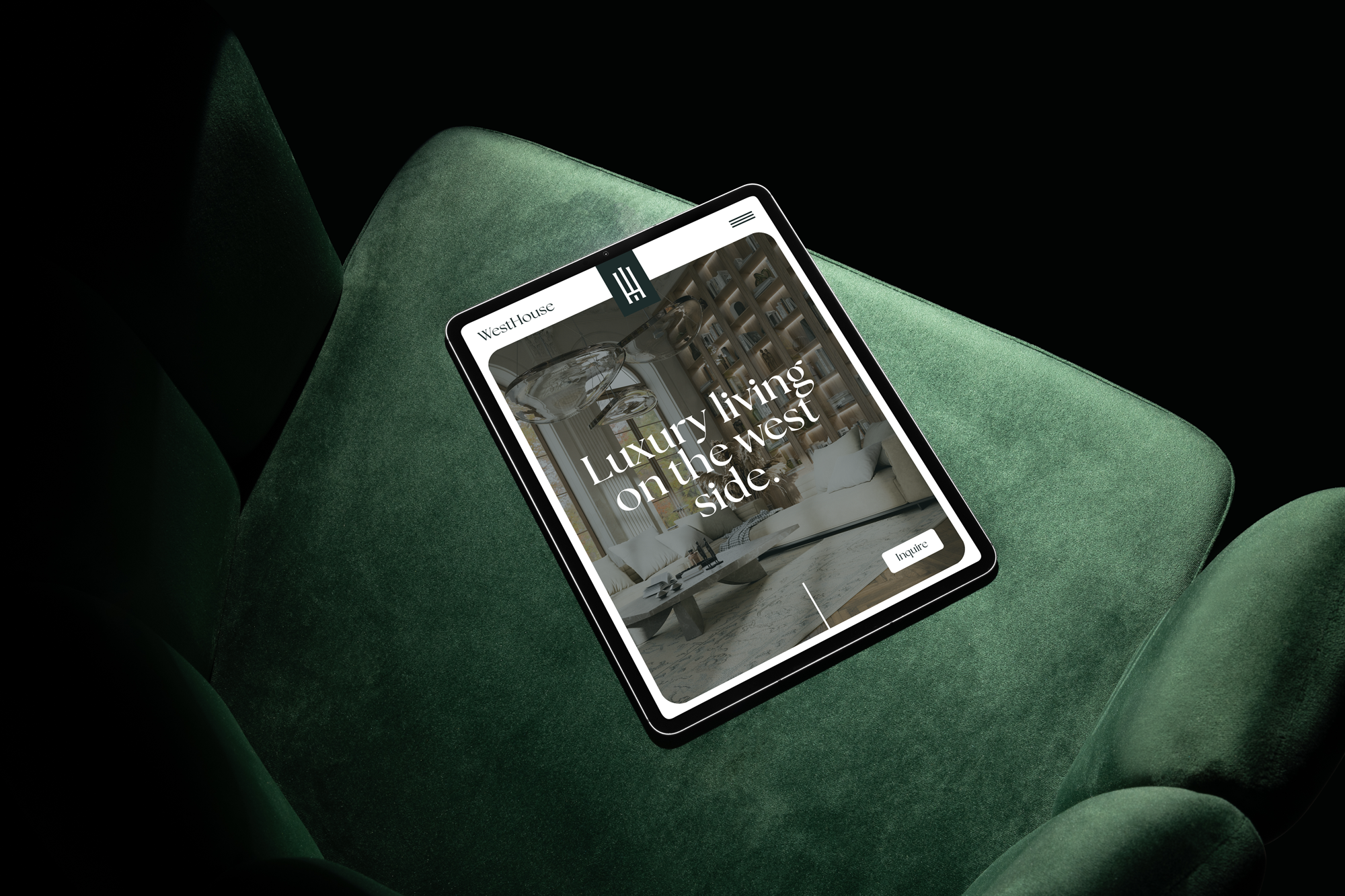
A heritage brand for a restored masterpiece on the Westside.
The WestHouse monogram meticulously interlocks a bold "W" and "H," creating a visually striking emblem that mirrors the structured elegance of iconic Manhattan architecture. Inspired by Art Deco motifs of New York's gilded skyscrapers, the clean, symmetrical lines of the logo reflect strength, stability, and prestige. Its form subtly references the architectural craftsmanship of New York’s early twentieth-century high rises, a timeless nod to historical sophistication paired with contemporary confidence.
Deliverables
Naming
Brand Design
Colors
Print Design
(Spec Work)


The Name
"WestHouse" was named to resonate with New York’s prestigious heritage neighborhoods and evoke an elevated, commanding perspective for those who seek refinement. Rooted in the grandeur of the city's historic West Side neighborhoods, the "WestHouse" name and logo was built to capture New York’s architectural legacy.


The Colors
WestHouse’s refined color palette embodies classic New York luxury. The sophisticated, deep green backdrop reflects the resilience and vitality of the city's verdant parks and historic neighborhoods, while crisp whites communicate elegance, purity, and exclusivity. These timeless contrasts draw inspiration from New York’s architectural textures—the gleaming marble of landmark buildings, the elegance of cast iron facades, and the quiet sophistication of historical brownstones. Each hue is intentionally chosen to evoke a sense of quiet authority, understated luxury, and an enduring legacy in the heart of the city.

Ready for next steps? We’d love to chat.
Feel free to book a call with me using this form, or send me an email at joe@brottman.co. Looking forward to hearing back.